Nota
Haz clic aquí para descargar el código completo del ejemplo o para ejecutar este ejemplo en tu navegador a través de Binder
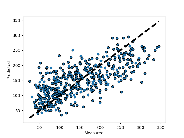
Graficando predicciones con validación cruzada
Este ejemplo muestra cómo utilizar cross_val_predict para visualizar los errores de predicción.
from sklearn import datasets
from sklearn.model_selection import cross_val_predict
from sklearn import linear_model
import matplotlib.pyplot as plt

lr = linear_model.LinearRegression()
X, y = datasets.load_diabetes(return_X_y=True)

# cross_val_predict returns an array of the same size as `y` where each entry
# is a prediction obtained by cross validation:
predicted = cross_val_predict(lr, X, y, cv=10)

fig, ax = plt.subplots()
ax.scatter(y, predicted, edgecolors=(0, 0, 0))
ax.plot([y.min(), y.max()], [y.min(), y.max()], 'k--', lw=4)
ax.set_xlabel('Measured')
ax.set_ylabel('Predicted')
plt.show()
Tiempo total de ejecución del script: ( 0 minutos 0.115 segundos)